
BTTR
Brand identity
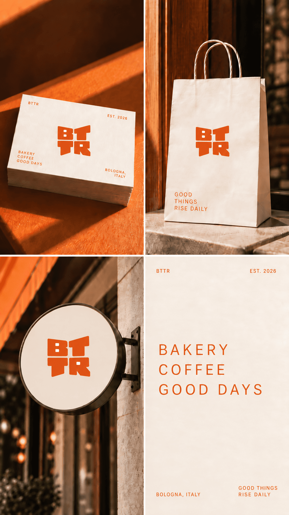
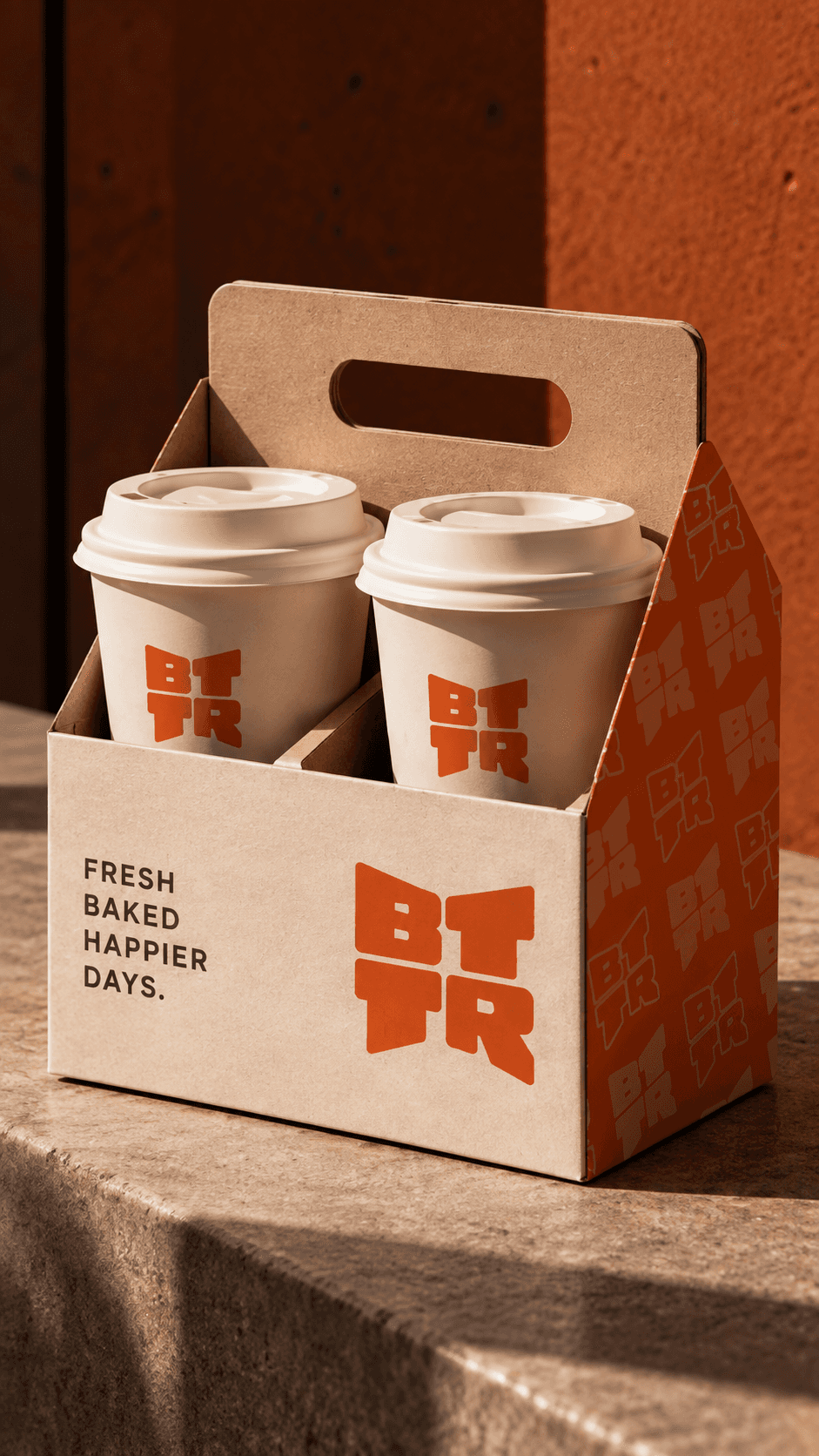
BTTR is a visual identity concept for a contemporary bakery. The project combines compact typography, warm colors, and a distinctive pattern applied across packaging, promotional materials, and social media content.
A new shape for everyday little pleasures.
(Concept)
BTTR is born from the idea of turning the breakfast ritual into a warm and contemporary brand experience. Inspired by the word “butter,” the project brings together a welcoming tone and a refined visual language rooted in the world of baking.
(Visual Identity)
The two-line wordmark, compact uppercase typography, and diagonal pattern create a distinctive system for packaging, promotional materials, and social content. Warm orange, cream, and dark brown reinforce the bakery’s contemporary yet familiar character.
(Outcome)
Visual System
Wordmark + Pattern
Applications
Packaging, promotional materials, social