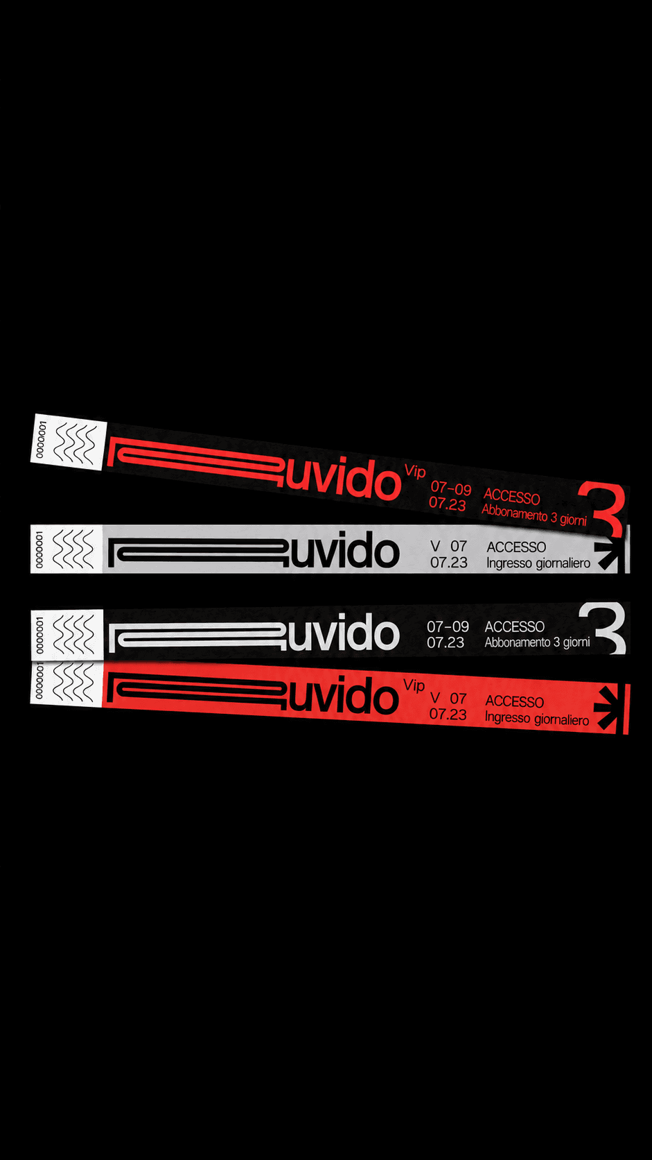
Ruvido - Festival
Brand identity
A refined identity system blending structure with expressive form.
A raw visual identity built through bold typography, modular forms, and high-impact graphic contrasts®.
(Research)
The project began by exploring independent music culture, street graphics, wayfinding systems, and printed ephemera. The aim was to create a visual language that felt immediate, physical, and unmistakably urban.
(Experiment)
The identity developed through modular symbols, stretched typography, strong red and black contrasts, and a flexible system designed to work across posters, wristbands, tickets, merchandise, and digital content.
(Results)
Visual System
Wordmark, Symbols + Graphic Language
Brand Applications
Print, Merchandise + Digital